Product Design
UX Research
Web3
Dapp Browser
Redesigning the Web3 gateway for Ninety Eight's Super Wallet — from cluttered information architecture to a clear, personalized experience.
Redesigning the Web3 gateway for Ninety Eight's Super Wallet — from cluttered information architecture to a clear, personalized experience.
Ninety Eight is a blockchain technology company that provides Web3 products and solutions. Its flagship product, Super Wallet, was launched in 2019. I joined the company in 2023, collaborating with a UX researcher and stakeholders to identify core issues in the Dapp Browser — the gateway to the Web3 ecosystem — and develop effective solutions to improve usability.
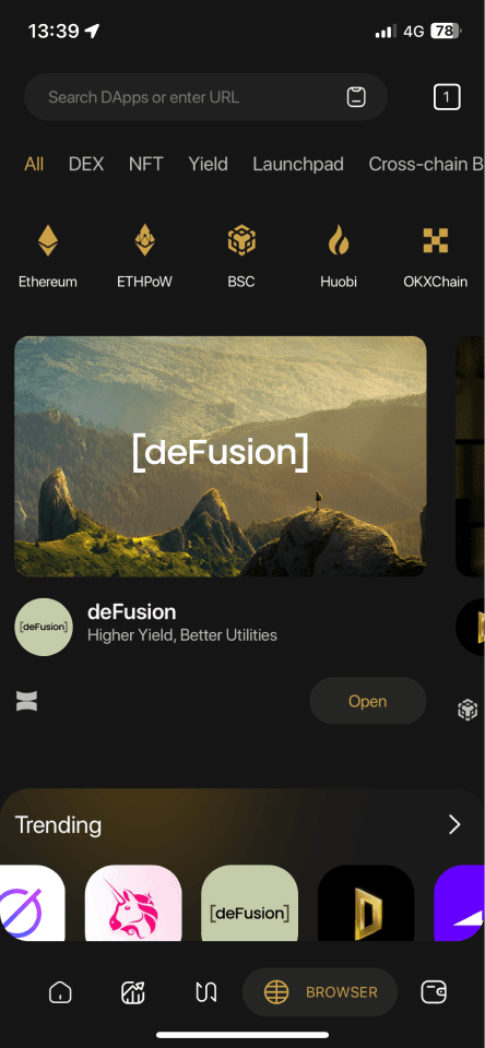
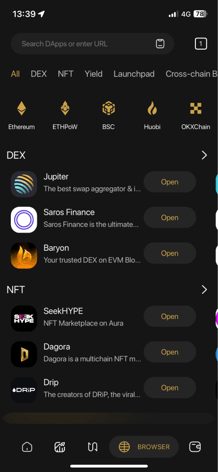
The Dapp Browser is where users frequently access decentralized services, participate in games, or join reward campaigns. It showcases a wide range of decentralized applications across multiple networks, allowing users to interact with them by connecting their wallets.
Feedback from stakeholders and users indicated the interface lacked essential UX and had ineffective information architecture — overlapping sections serving similar purposes with no clear distinction, no personalization, and no tailored recommendations.
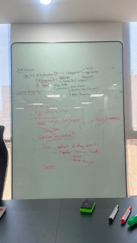
Three research methods were conducted to uncover root causes and validate design direction.
Identified user personas, gathered feedback on pain points, and collected improvement suggestions from users who frequently engage with the Dapp Browser.
Evaluated the entire interface and user flow to identify usability issues, determine their impact level, and propose UX and UI improvements.
Examined how similar products implement the Dapp Browser to identify opportunities for enhancement, emerging trends, and successful design patterns.
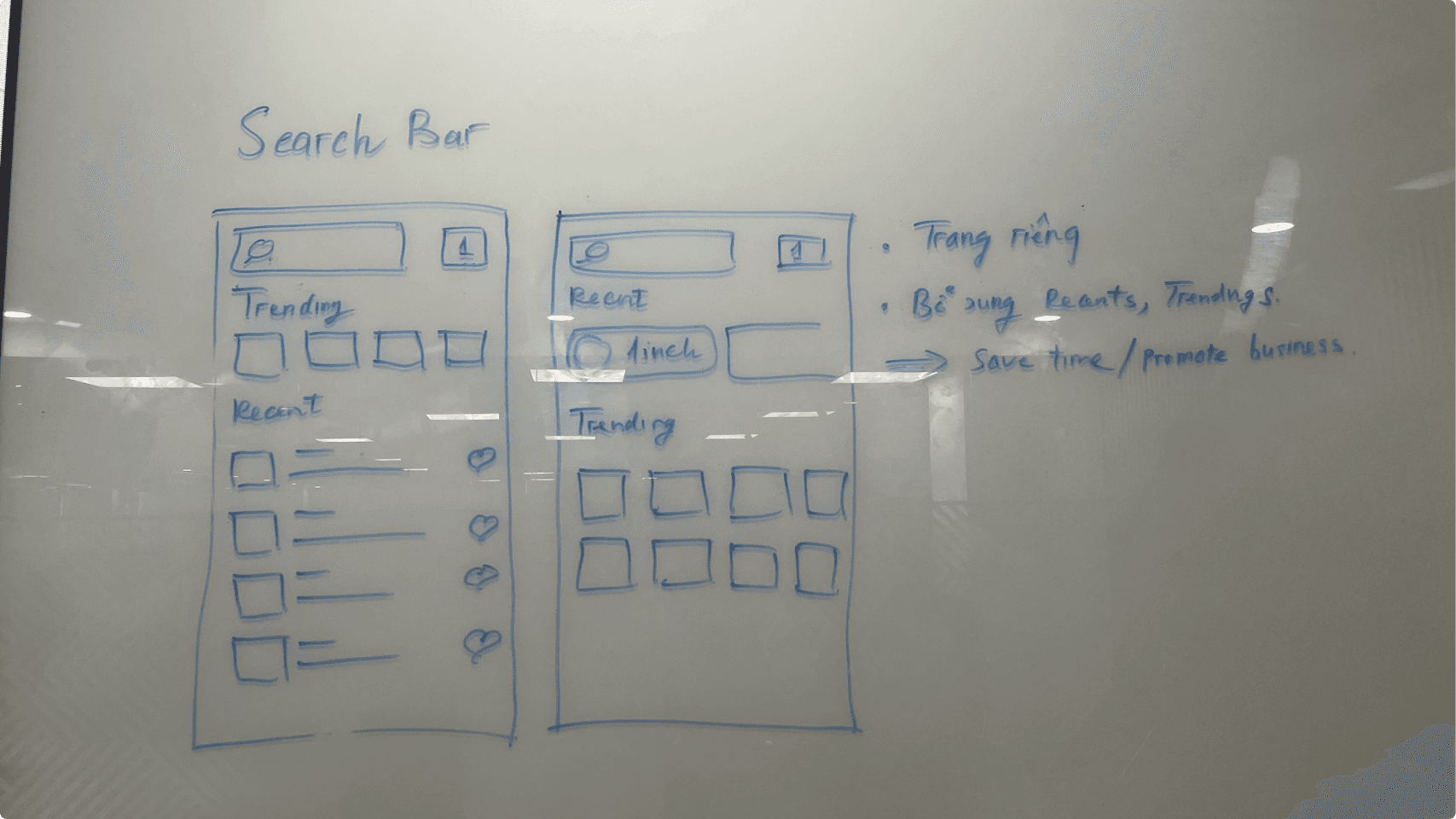
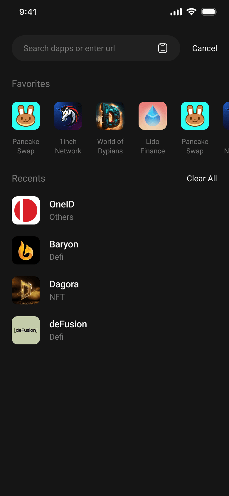
Users primarily access DApps through the Search function — they already have a clear purpose and intent before opening the Dapp Browser.
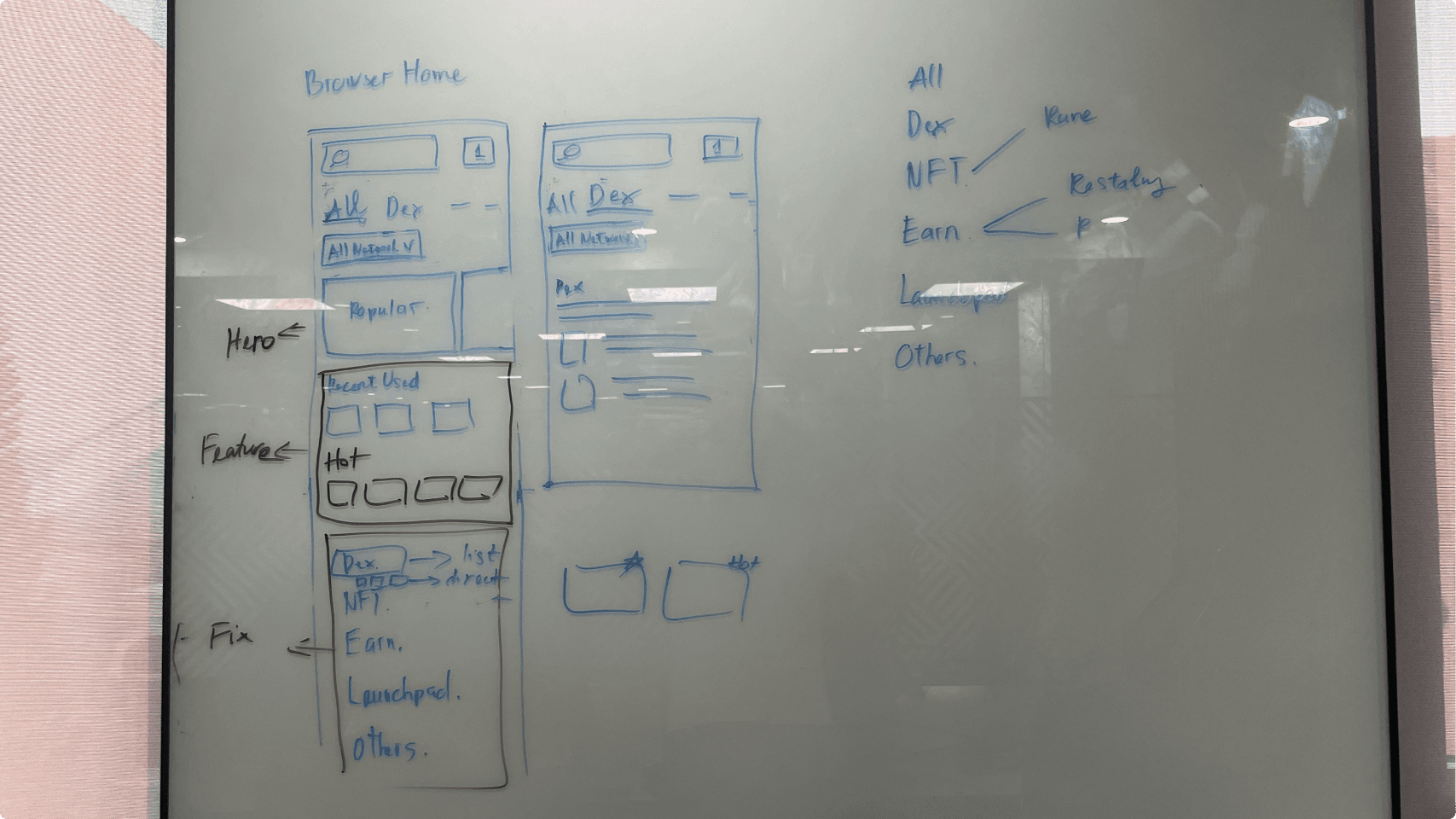
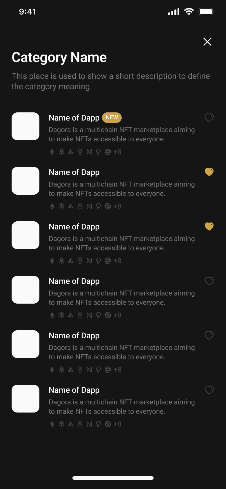
The layout lacks personalized customization and tailored recommendations. Overlapping sections (Popular vs. Trending) serve similar purposes with no clear distinctions.
From research, three objectives shaped the design direction: eliminate core friction points, define measurable engagement metrics, and validate solutions through user testing.
The redesign addressed four distinct areas of the Dapp Browser, each targeting a specific friction point uncovered in research.
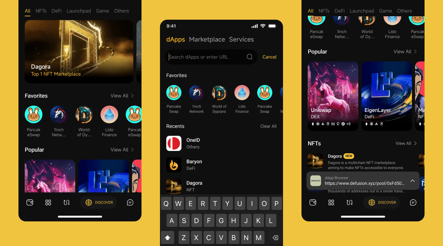
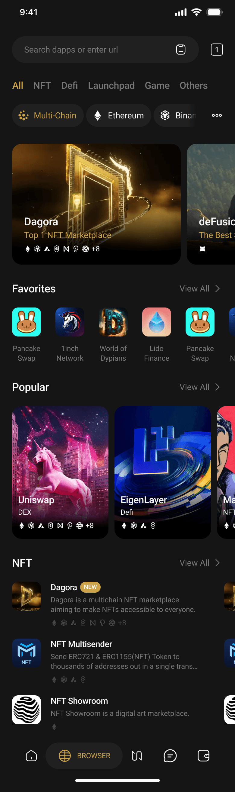
The home screen was restructured into three clear zones: a Hero Slider for highlighting featured Dapps, a Featured Zone with curated sections (Popular, C98 Picks, Favorites), and a Fixed Zone for Dapp categories. The number of sections in the Featured Zone can flex based on business needs.
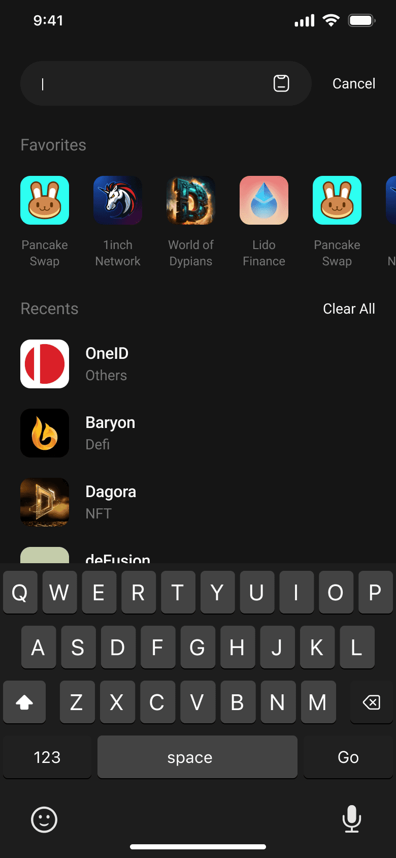
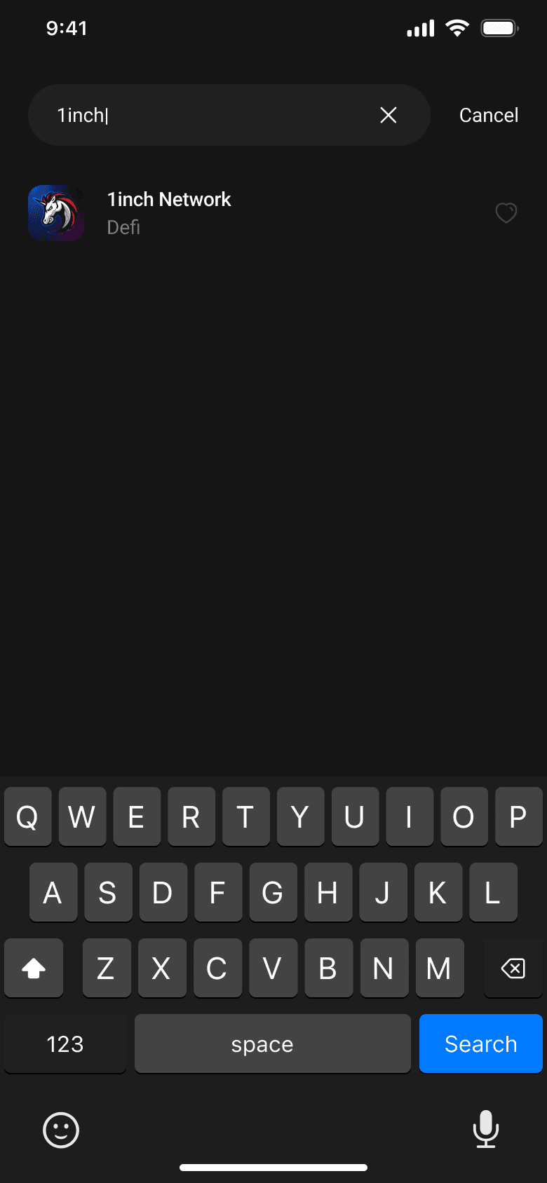
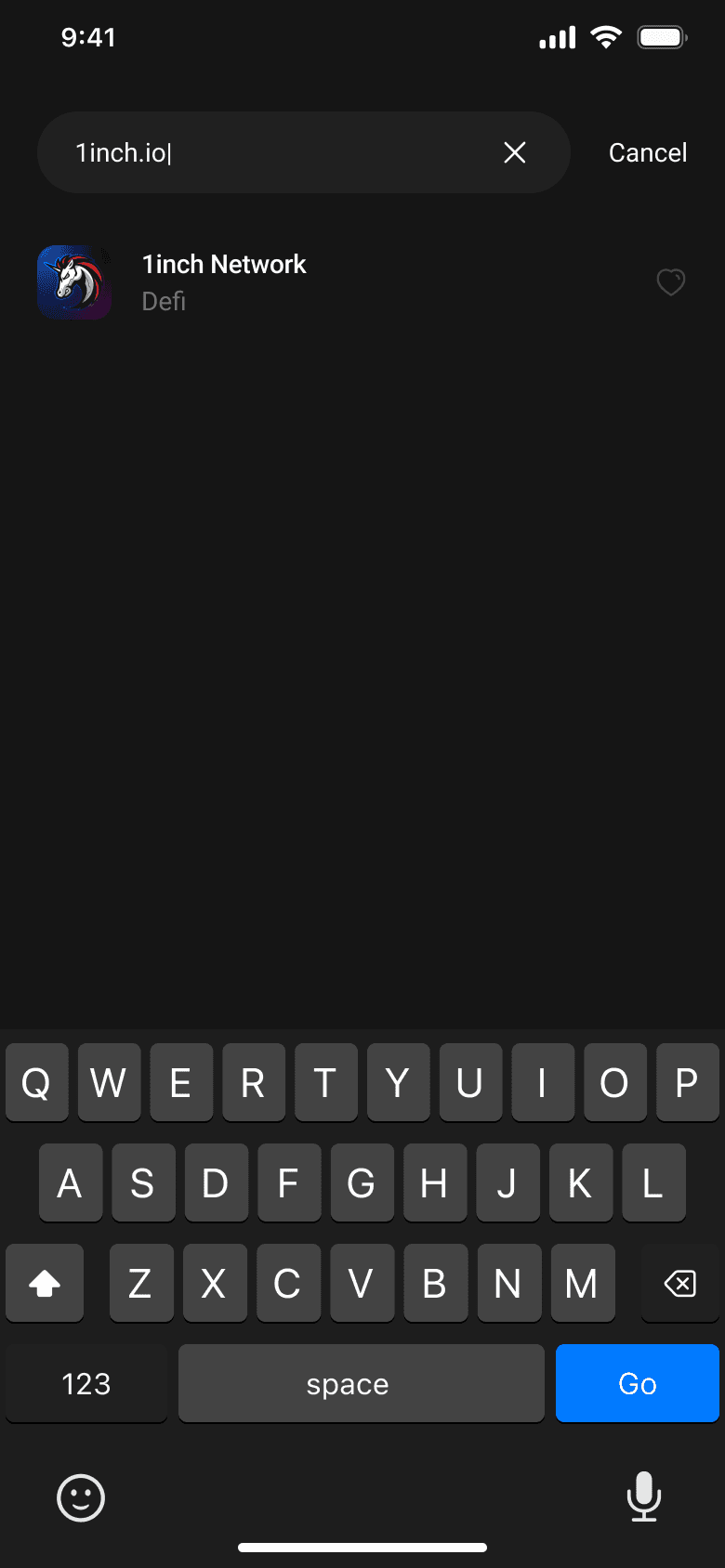
A focus state was introduced when users tap the search bar, surfacing Favorites and Recents immediately. The primary button on the keyboard adapts dynamically — showing "GO" when a domain is detected, and "Search" for keyword queries directing users to Google.
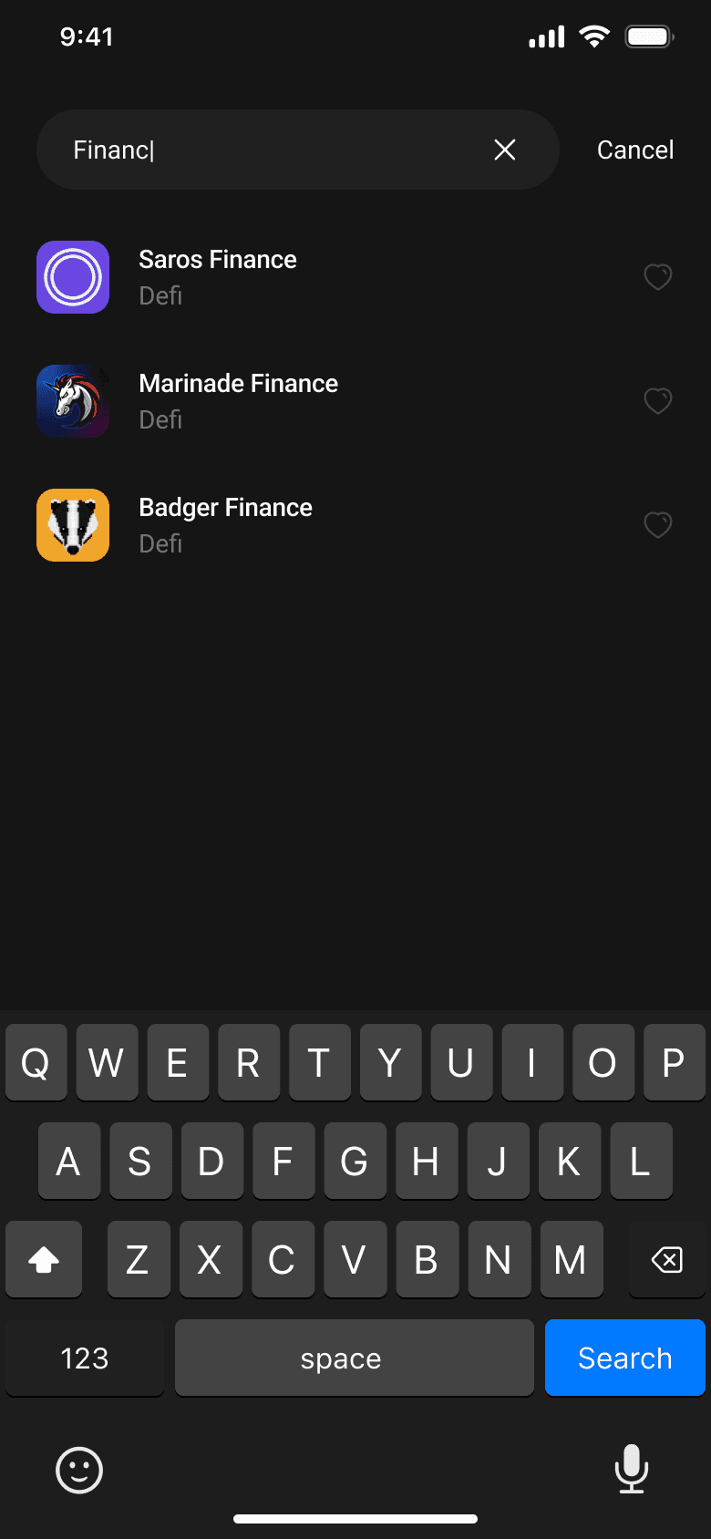
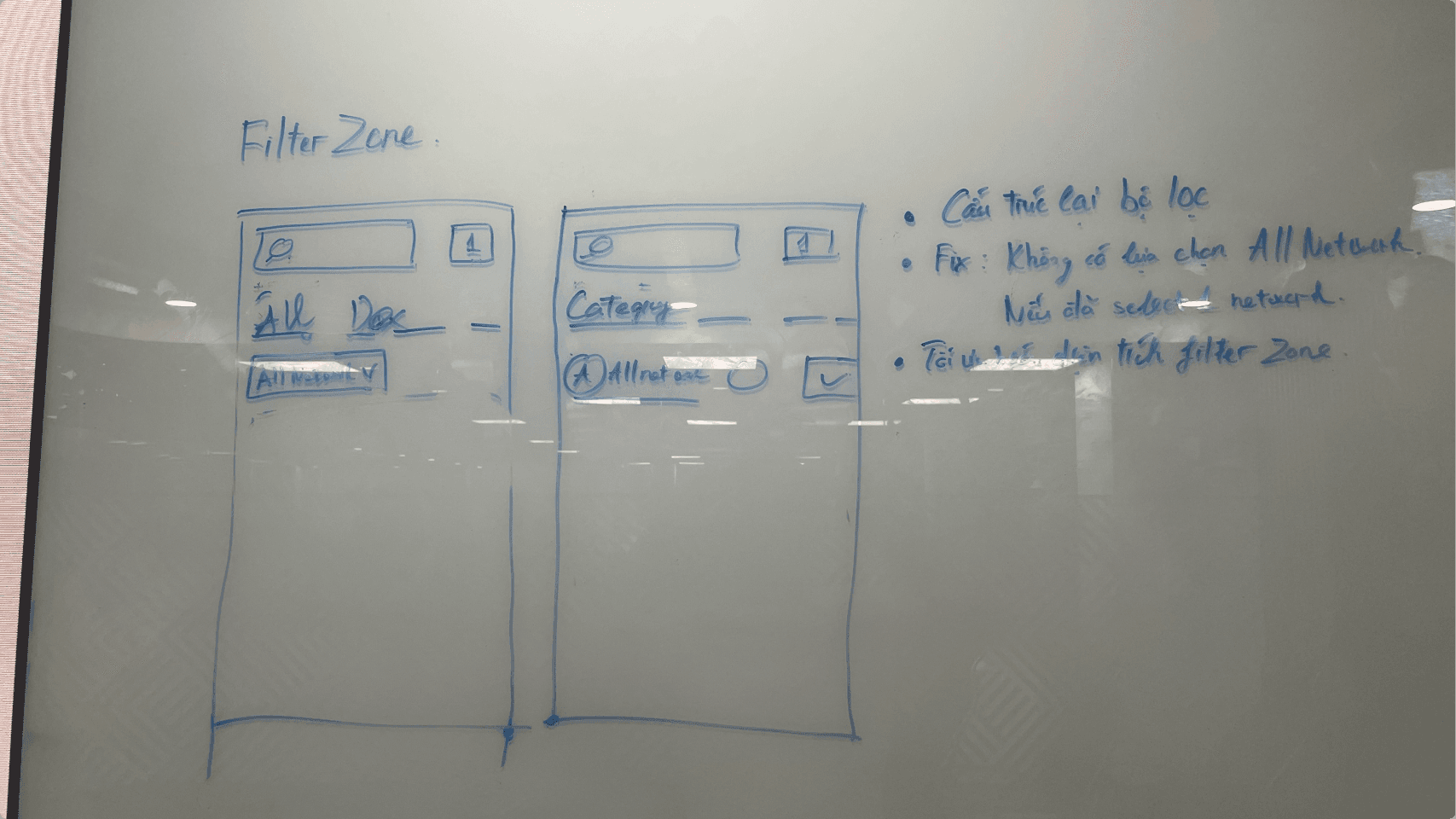
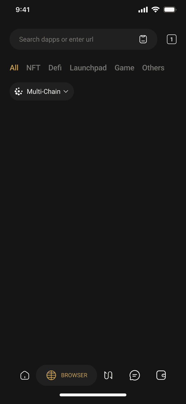
The network filter was expanded and given a Multi-Chain default option, resolving the double-tap issue users experienced when resetting filters. Category filters were reorganised into: All, DeFi, NFT, Launchpad, Game, Others.
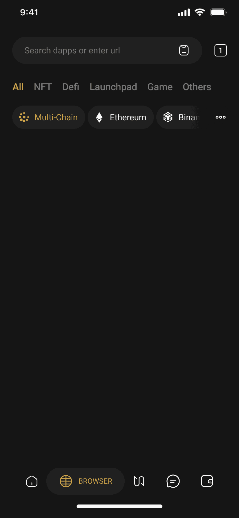
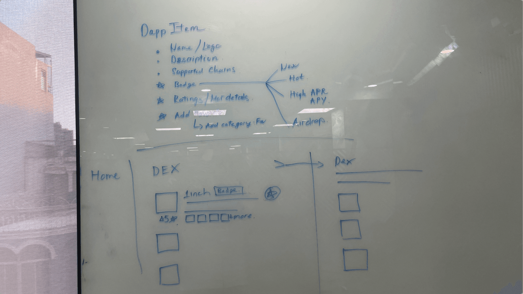
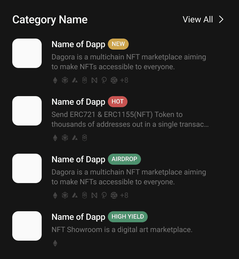
Each Dapp card was restructured to surface the most relevant information at a glance: logo, name, brief description (max 2 lines), supported networks (up to 7 shown with N+ overflow), and status badges (New, Hot, Airdrop, High Yield).
Mobile prototypes were tested with 5 users across three scenarios — browsing the homepage, searching for an application, and evaluating Dapp item details.
Users found the information structure transparent enough to keep them engaged and encourage scrolling.
Users felt category prioritization effectively highlighted trending applications, helping them stay updated quickly.
Users agreed that status labels (trending, new, profitable) helped them quickly recognise relevant applications.
Product Design | User Experience Design
I adore solving problems and designing digital products.